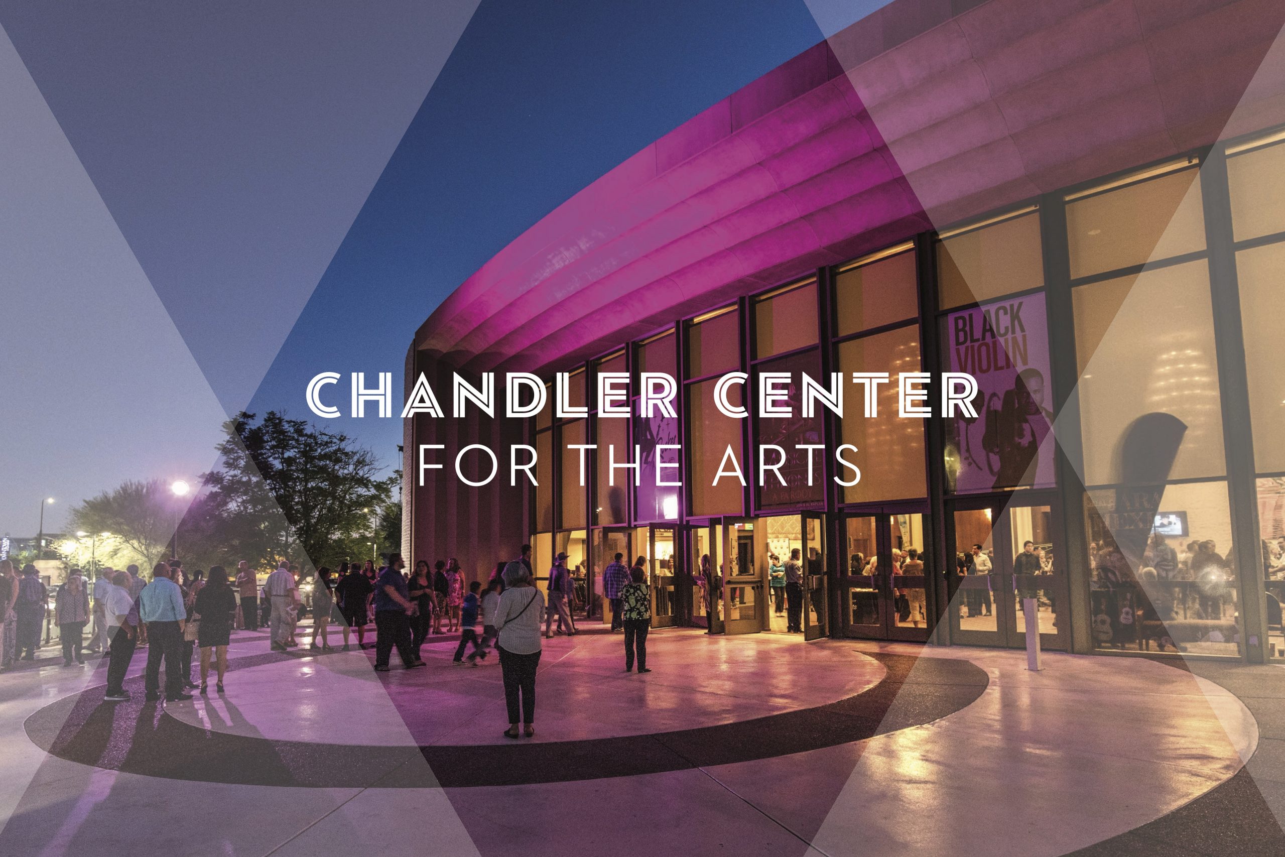
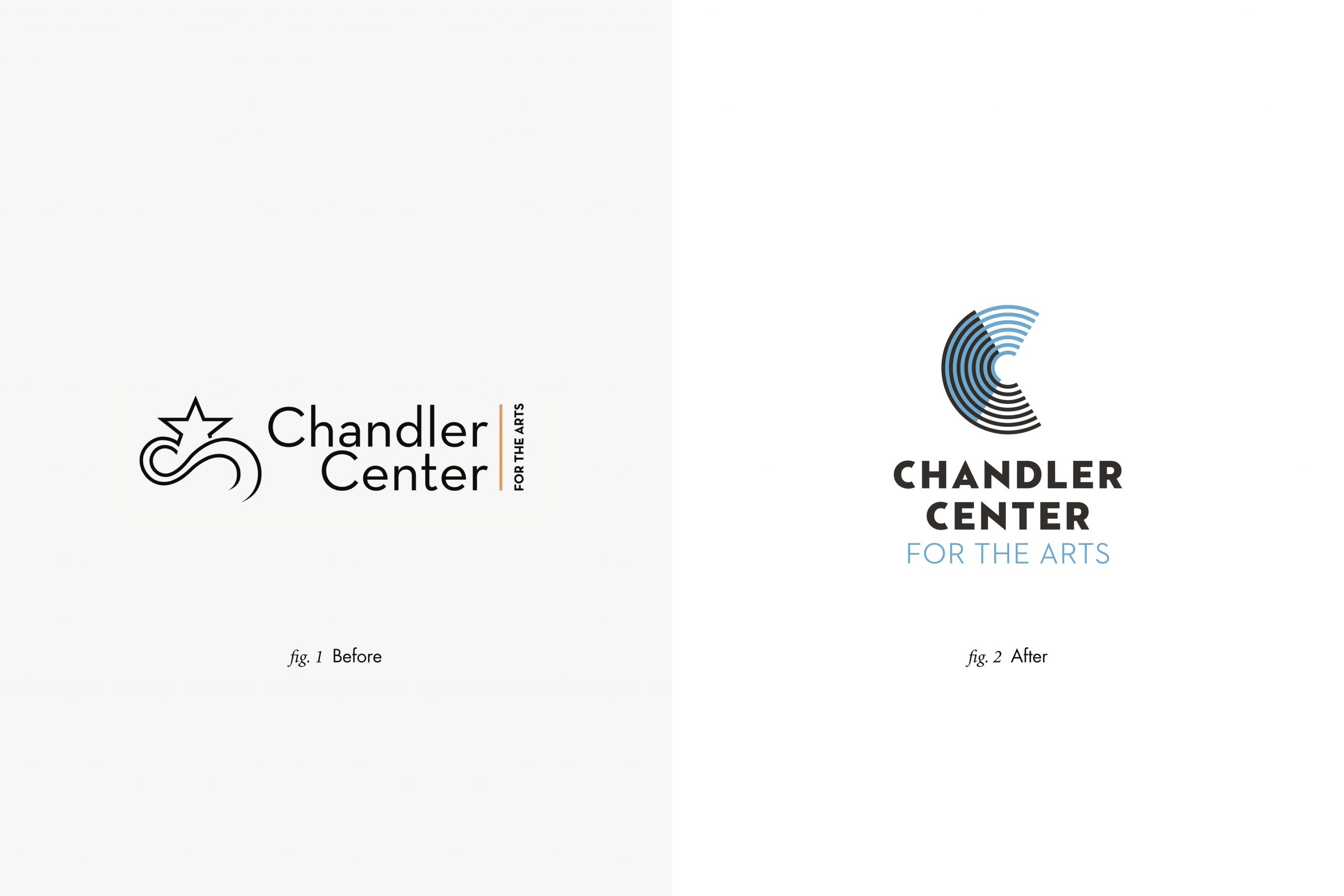
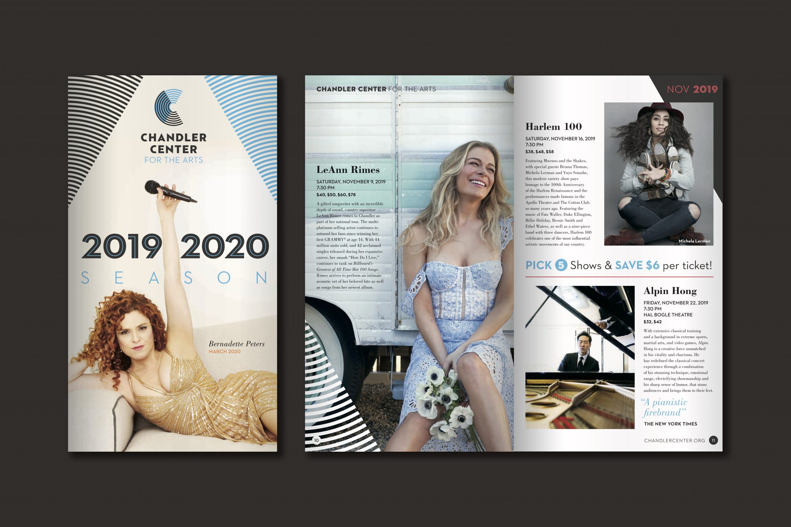
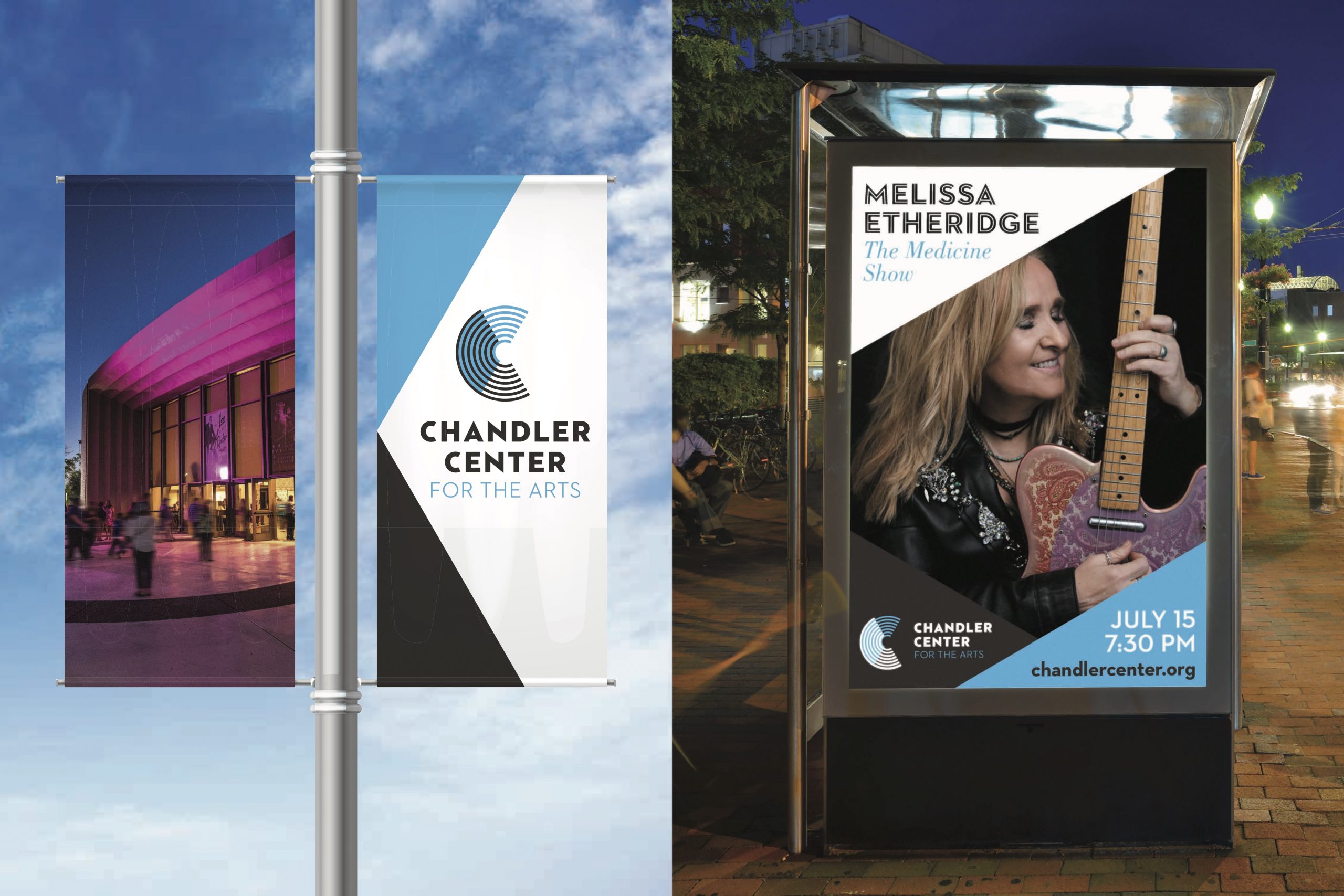
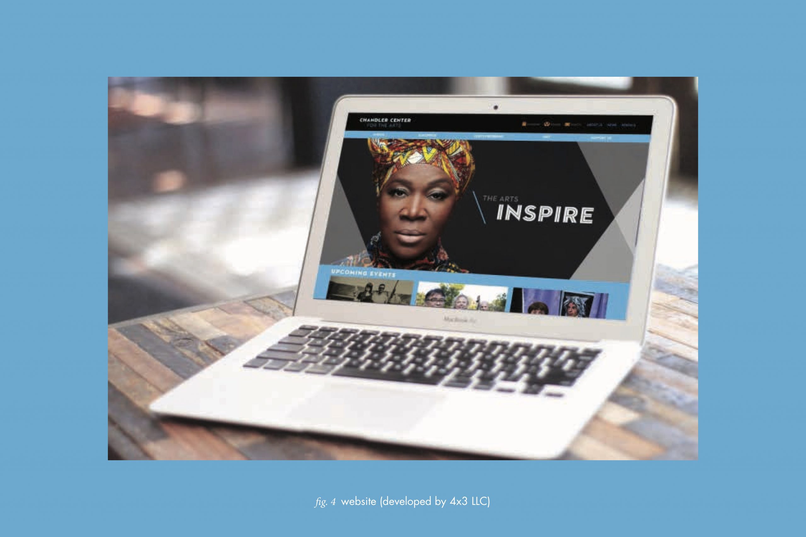
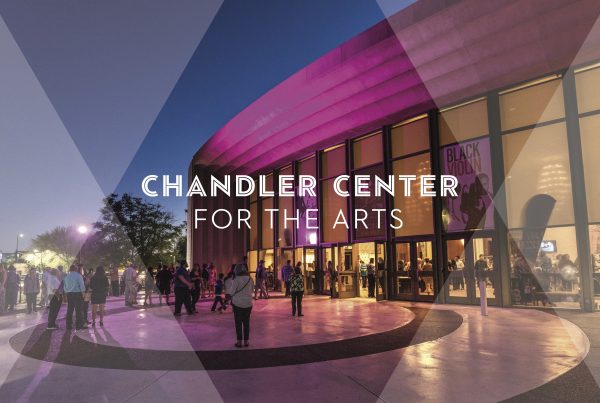
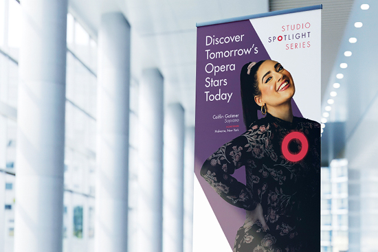
Chandler Center for the Arts, a performing arts venue serving both the local school district and a broader metro-Phoenix audience, had a brand image problem. The theater features a state-of-the-art revolving stage, and the Center hosts an impressive lineup of national touring artists. But its logo and marketing materials were dated, and incapable of positioning the theater as an exciting hub for diverse audiences to come together for culturally rich experiences. The new logo, with revolving Cs that merge to create a vibrant line pattern captures this excitement while also honoring the city of Chandler’s roots in agriculture and technology.
